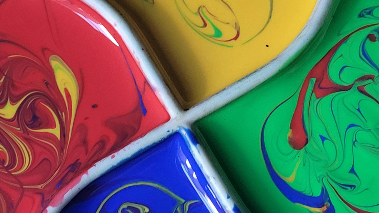
One of the funny things about colour is it has everything, and nothing, to do with perspective.
Because there’s no way to guarantee that you and I see the same colour when we both point at ‘yellow’ on a colour chart. We might try to describe what we see – a bright, full colour – but that doesn’t describe the quality of what yellow is, just its saturation and brightness. So, we change tack. Let’s call it the happy colour, the shining, optimistic hue of childhood and buttercups. We can agree on that, and so we can assure ourselves we are seeing the same thing, and rest easy, once again.
Except we still haven’t learnt anything about yellow. Rather, we’ve just repeated the qualities disseminated from our shared culture. And this doesn’t work, if you, reader, happen to be from the Yangzhou province of China, where you might disagree with our descriptions, wholeheartedly. Yellow, to you, is the colour of prosperity, of divinity and nobility, not of naïve, cheerful childhoods. Our fundamental understanding of colour is biasedly predefined by the limited usages of it we see in our own lives.
So, you might be inclined to conclude that colour is not an objective consideration, rather, a concept interpreted personally and uniquely by each one of us. That would seem to be logical, since its objectively definable boundaries are provenly weak. But, while seemingly logical, that would be an incorrect scientific assertion. Because when Isaac Newton used a prism to split apart a beam of white sunlight, he discovered something about the colours trapped inside – they weren’t just distinguishable to his eyes, but objectively discernible at measurably different frequencies.
Of the three primary colours on the RGB scale (red, green and blue), red has the lowest frequency and the longest wavelength, while blue has the highest frequency and shortest wavelength. Yellow is somewhere in the middle. So, if we return to the hypothetical of you and I arguing over what colour a buttercup is, we could settle the discussion by agreeing it’s ‘about 510 to 530 THz’, shake hands, and wish neither of us had ever asked the question in the first place.
What does colour have to do with marketing?
Now we’ve got the complicated bit out of the way, we can start to look at how the dually objective and subjective quality of light affects our buying habits. Because this is a marketing blog, after all. Seriously, that’s what this is. What? What are you laughing at?
The most popular way to make this leap is to adopt the framework of colour psychology, which amounts to a formal amalgamation of the predominate cultural interpretations of colours. With this you uncover general trends between colour hues and their emotional associations, but you lose a lot of the nuance in the process. Still – provided you belong to the majority – it’s relatively accurate.
For example, it explains the overwhelming effectiveness of red – which, in marketing, is very much the nuclear warhead of colours. Colour psychology tells us that people consider red to be active, vivid, urgent, resolute, powerful and assertive. It is how we marketers drive action, it is what we colour our ‘CLICK NOW!’ buttons with and it is certainly the colour we use to encircle random things on our YouTube thumbnails. Red commands attention, hence why you also notice it in a lot of life’s more functional designs, like on stop signs, ambulances and warning labels.
On the other end of the spectrum, we have blue, which, according to research, conveys the opposite emotions. If red commands urgency, blue diffuses it. The entire ‘cooler’ end of the spectrum is said to have this effect – calmness, serenity, security, equilibrium, consistency – and so it is of no surprise, then, that the cooler colours, and blue, are overwhelmingly used for both corporate branding positions and pharmaceutical products. Places that really want you to chill out and stop worrying – quit with the questions, alright?
There are of course a litany of other associations that don’t just stem from the temperature of a given hue. Green suggests nature, and so is used for environmentally friendly products. Yellow suggests youth and fun, and so is adopted for toys and games. Truly, if you’re actively looking for a rabbit hole to tumble down, you can easily lose a few days looking into what every secondary colour denotes, and then what its tertiary combinations mean or what its complementary colours suggest. But that’s not the hole we’re tumbling down today. Instead, we’re investigating the recent rise of marketing with one, singular colour.
The rise of monochromatic marketing
Barbie. Brat. As fast as your brain processes those words, it summons the corresponding colours. Barbie Pink. Brat Green. That’s a handy trick when it comes to marketing. Particularly because associations tend to go both ways. You see a dirty neon green, you think of Brat, you see a vibrant magenta pink, you think of Barbie. That’s an association that every marketer dreams of commanding. It’s like living in your consumer’s brain, rent-free. It’s like making sure when anyone sees a red can, they think of…
Come to think of it, monochromatic marketing isn’t really a new thing at all, is it? Not in terms of commercial products, anyway. Because we have Coca-Cola, Starbucks, Taco Bell, KFC, Skittles (lots of red in fast food, isn’t there?), Fanta, Subway and countless others using one colour to lead all their visuals. Some have even been so successful with this strategy that they’ve changed the corresponding colour psychology. Most famously, Coca-Cola’s advertising campaigns made Christmas and Santa Claus more recognisably depicted as red, rather than the traditional yuletide colours of green and brown.
But one place where it is new is in the field of entertainment, where ‘branding’ typically involves placing one’s stake in the ground, firmly, and decisively – setting your marketing behind a single piece of album artwork, reveal poster, or film trailer. When described like this, it seems surprising that entertainment hasn’t already capitalised on monochromatic marketing – but then again, when you have less imagery and fewer assets to play with, why restrict yourself to the confines of a single colour? And anyway, how could music, performance or creation be defined by something as simple as one colour, like a stupid can of Coke?
Except Grammy-award-winning Brat was green and Oscar-nominated Barbie was pink. And so was the merchandise, and so were the tours, and so were the millions of pounds worth of follow-ups. So, naturally, this has bled out into our culture and subsequently our marketing departments. So much so, that we can already identify two clear successors (or imitators, depending on how cynical you feel) of Brat and Barbie, in Olivia Rodrigo and Wuthering Heights.
Olivia Rodridgo has been purple since 2021. It’s the dominant colour on her two studio albums and most of her singles. However, after five years, she randomly stripped it from her identity. Overnight, her website rebooted in baby pink, and in parallel, a purple mural appeared in LA with her logo. Day-by-day, this was repainted lighter hues, until it eventually became baby pink. She followed this with more publicity stunts that continued to place ‘pink’ things at their core. It sent her fans wild and primed them perfectly for her new album – you seem pretty sad for a girl so in love – the artwork for which heroed her in a baby pink dress.
To a slightly lesser extent, Wuthering Heights attempted to associate itself with the colour red, as much as it could. From posters to promotional content, red carpets to red dresses, it’s the reddest film of the year so far. Which of course, it should be. Wuthering Heights is ‘the greatest love story of all time’, and what better communicates love than a big, juicy splash of red? But this is also director Emerald Fennell’s third feature film, and there is a tendency for her films to be marketed with hyper saturated colours on the hotter end of the spectrum. Wuthering Heights then, is perhaps less striking out in a deliberate pursuit of monochromatic marketing success than following an artistic inclination.
So, how can brands use colour more intelligently in marketing?
In the opening chapter of my much-anticipated advertising/self-help book: In a world of white noise, be a prism, I make a neat segue from the carnivore diet into my predictions for the future of monochromatic marketing. Without spoiling too much, I will discuss some of those assertions here – pre-orders release June 2027, retail £45.99.
Using a single colour for your brand is typically not a valid strategy in most cases. In sociological terms, this is because a single colour does not earn your brand any cultural capital on its own. To truly earn the benefits of colour psychology and colour association, your brand must – paradoxically – be strong enough to stand on its own two feet, separate to the colour. Take the examples mentioned here – Brat, Barbie, Wuthering Heights, Olivia Rodrigo. The authors behind these products were already recognisable long before they implemented tendencies of monochromatic marketing.
I believe that the apparent rise of monochromatic marketing says less about the technique itself, and more about the entertainment industry. Promotional materials for albums, films and even tours, are increasingly requiring tighter cohesion as they are distributed across an ever-widening number of channels, and so it is no surprise that marketing departments are deploying techniques utilised by products that ship billions of units worldwide.
But even if you are looking at marketing a product monochromatically, it’s still not so easy as simply copying what the big boys do. It can be a perfectly good decision to start off a new company with one colour in mind, and stick to it for years to come, but it will take time to become effective.
The upside is that when it does, it pays off massively. So massively, that you might end up making Christmas the same colour as your very own Pizza Hut, Wendy’s, McDonalds, Chipotle, Burger King, Chick-fil-A, Nando’s…
So, the question is: do you have the time, capital and patience to wait that long? And more importantly, does your designer?