Rebrand and new website
RDAC
A new look and feel for an accessible transport charity.

Objectives
RDAC is a charity that provides assessments for people with medical conditions or disabilities to help them regain or maintain their independence. They reached out to us to support them with revitalising their brand across digital and POS in order to become more accessible with a modern approach.
Using emotional intelligence
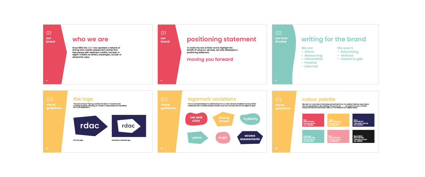
The core aim of RDAC is to give people the ‘freedom to move’ by making driving assessments easily accessible and by offering support for those using public transport. We thought, then, that our solution for their identity should move too. The logo we created was animated, with the printed versions being ‘freeze frames’ of the animation – ever-changing, always in motion.
Solution
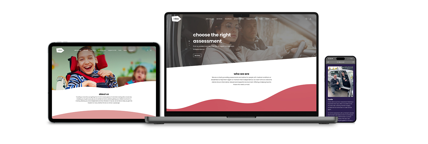
We created a site with accessibility as the focus, one that considered all users by having intuitive navigation and easy touchpoints for contact forms and payments. The site is a one-stop-shop for the target audience, allowing users to make self-referrals, download useful PDFs and find support for their medical conditions.
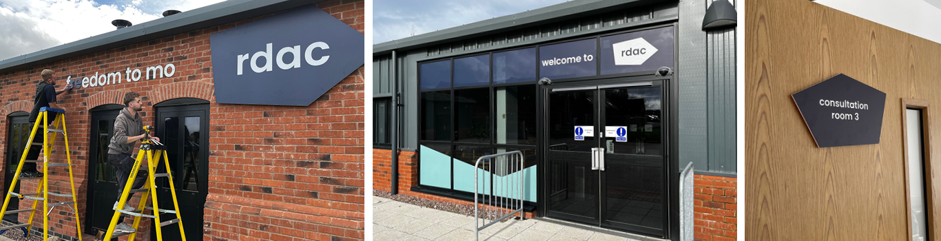
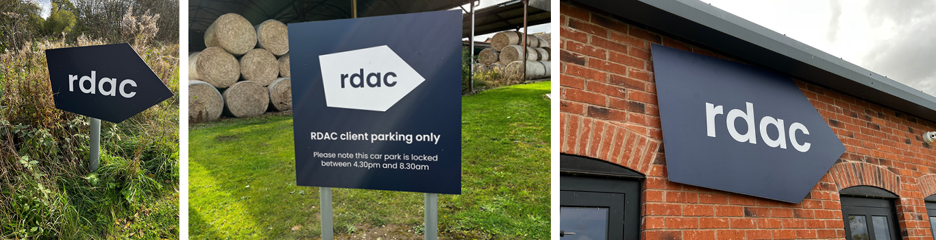
We also supported RDAC with an overhaul of its point of sale and internal documents in line with its renovated branding. This consisted of design and artwork for its HQ, a wealth of merchandise and the production of a leaflet.
Results
The refreshed brand and new website heralds a new start for the charity. “It’s absolutely amazing – it really does look incredible!” said Amy Leddington, Head of Marketing and Business Operations, RDAC.