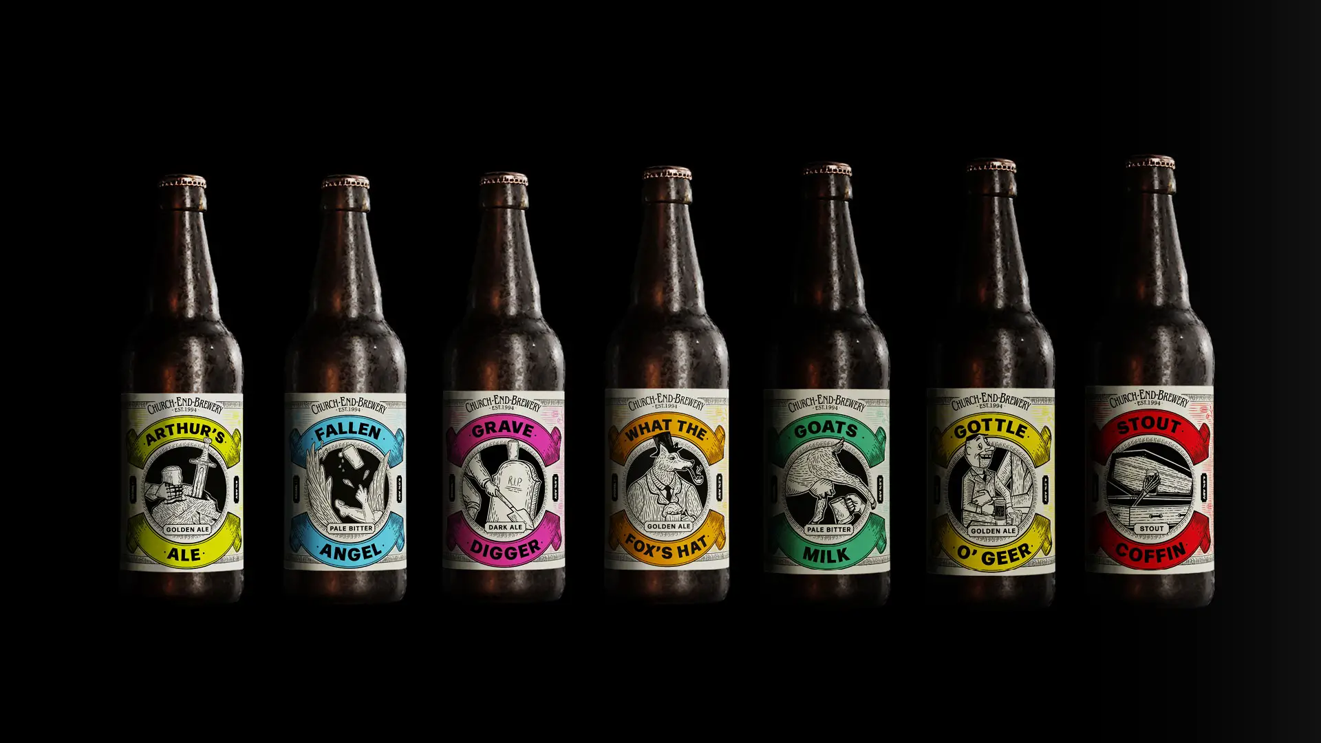
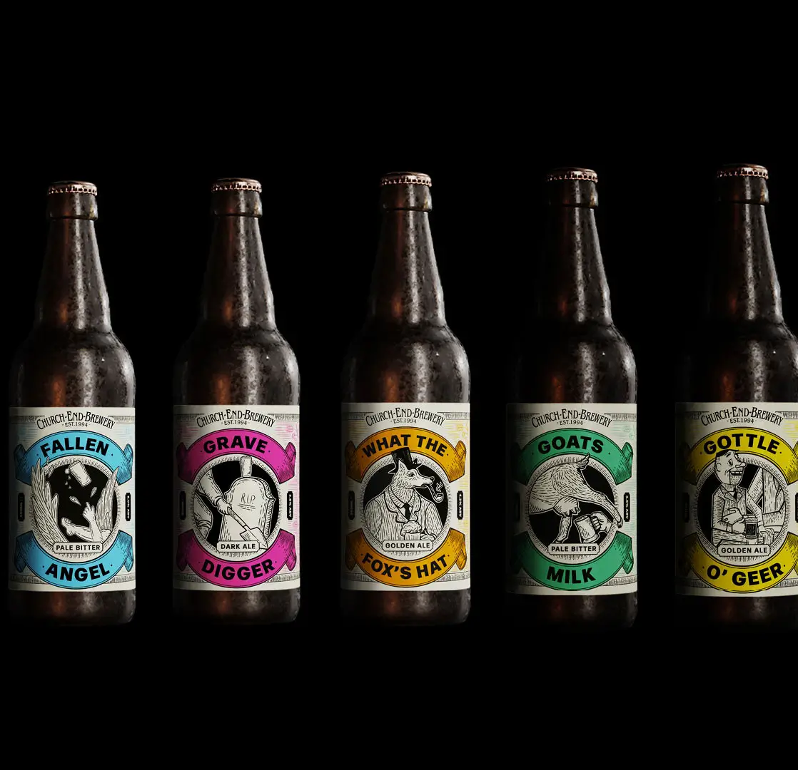
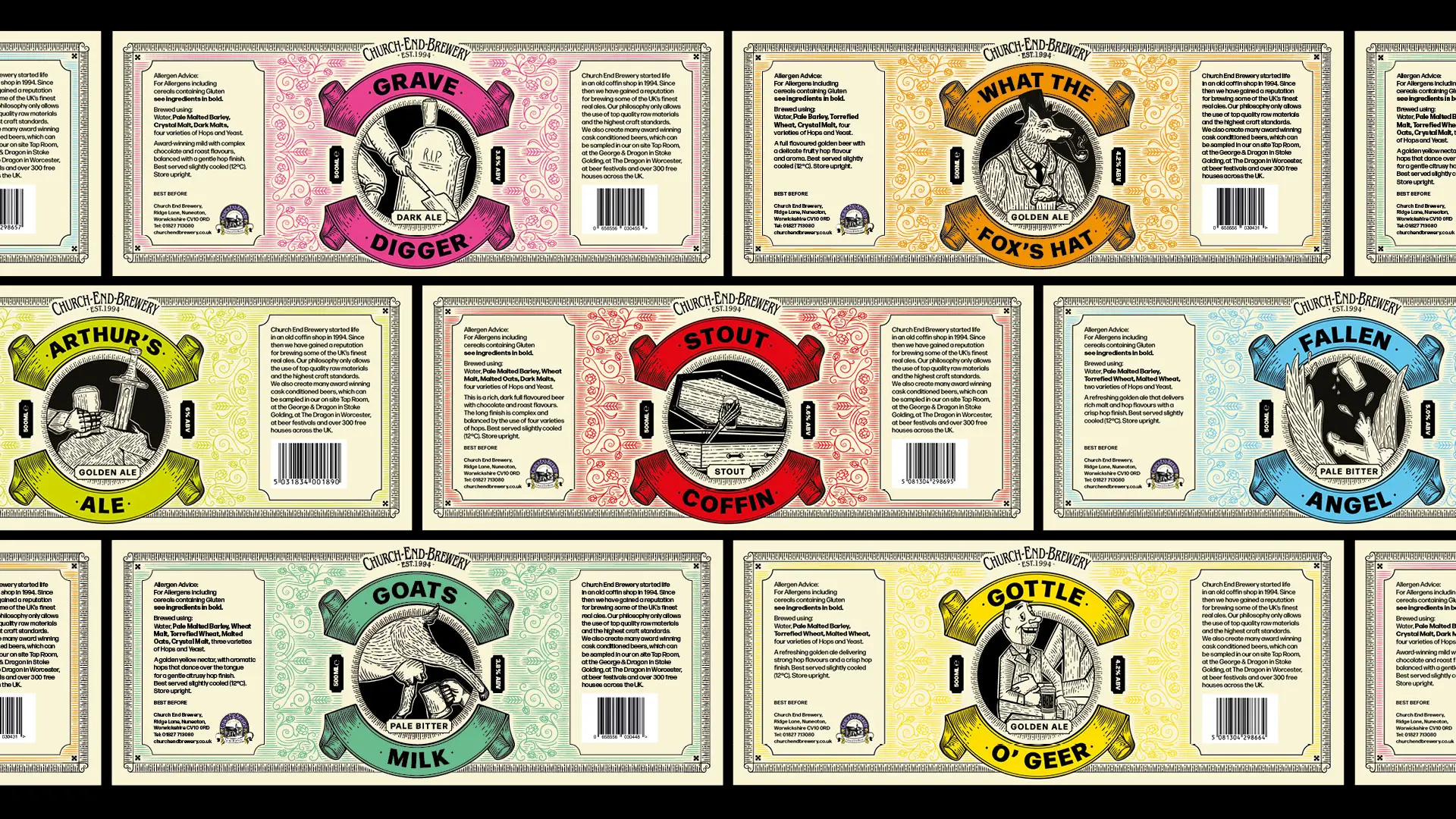
Packaging redesign
Church End Brewery
How we changed the fortunes of a microbrewery with an on-point packaging redesign for their range of bottled beers.
Objective
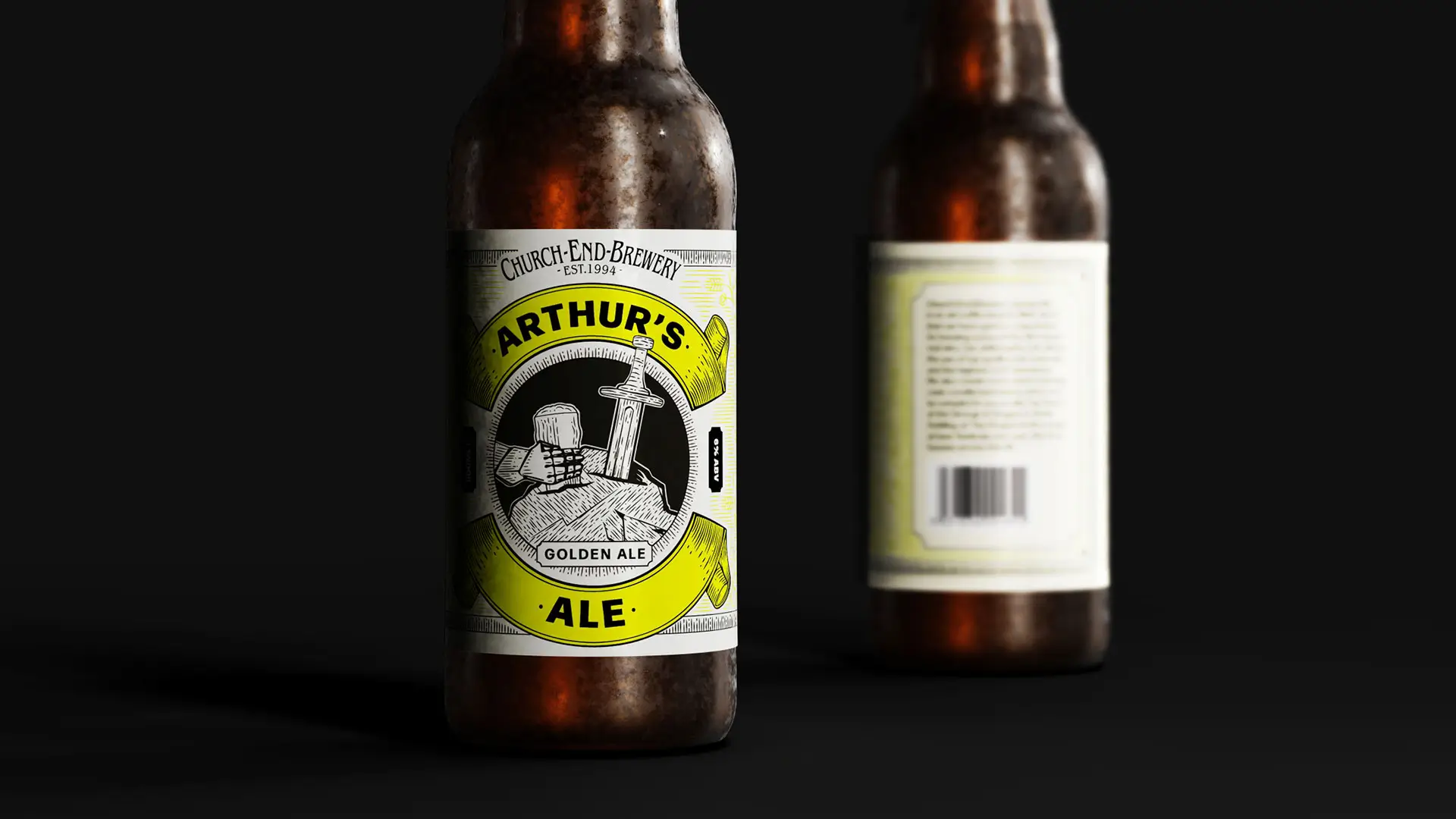
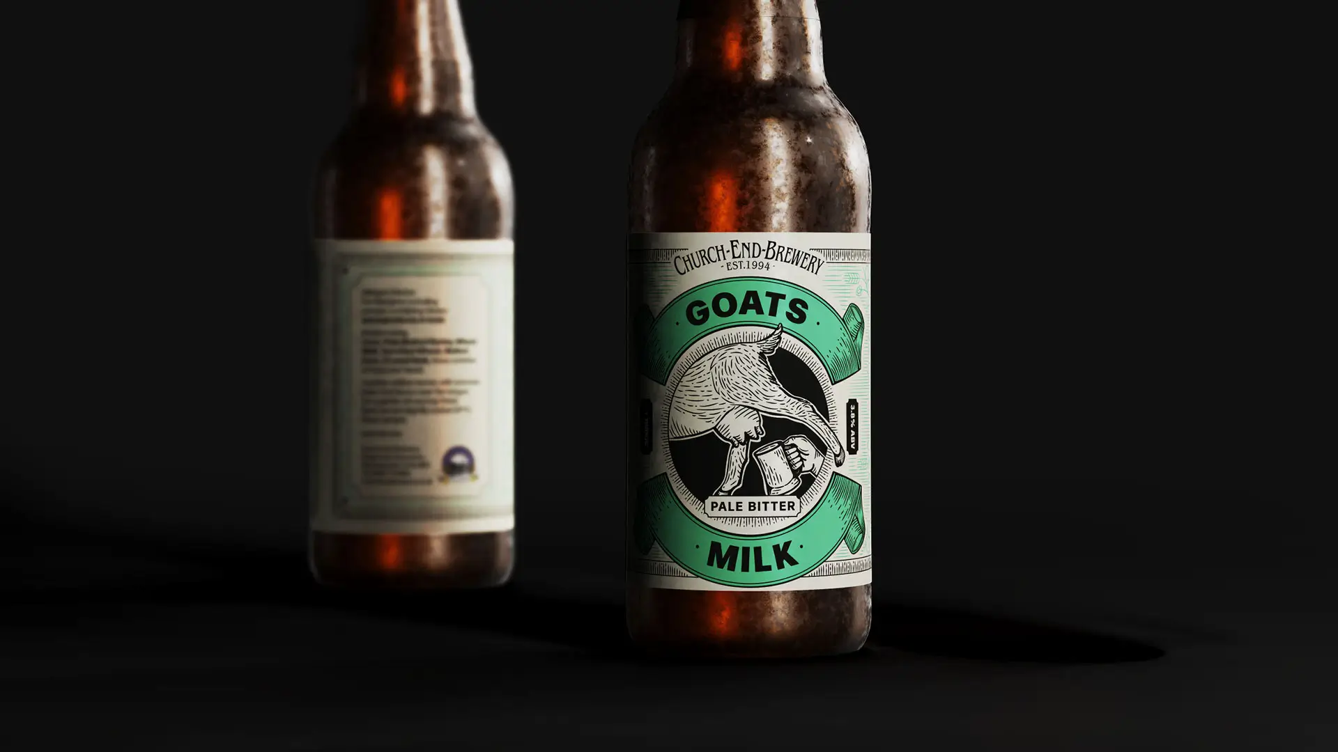
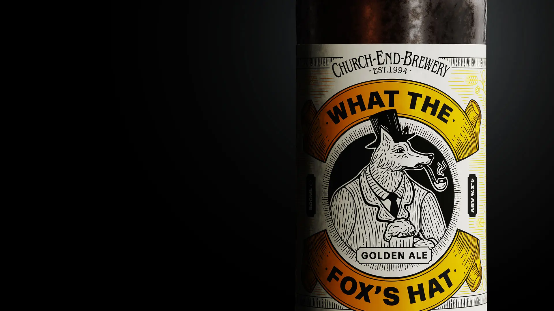
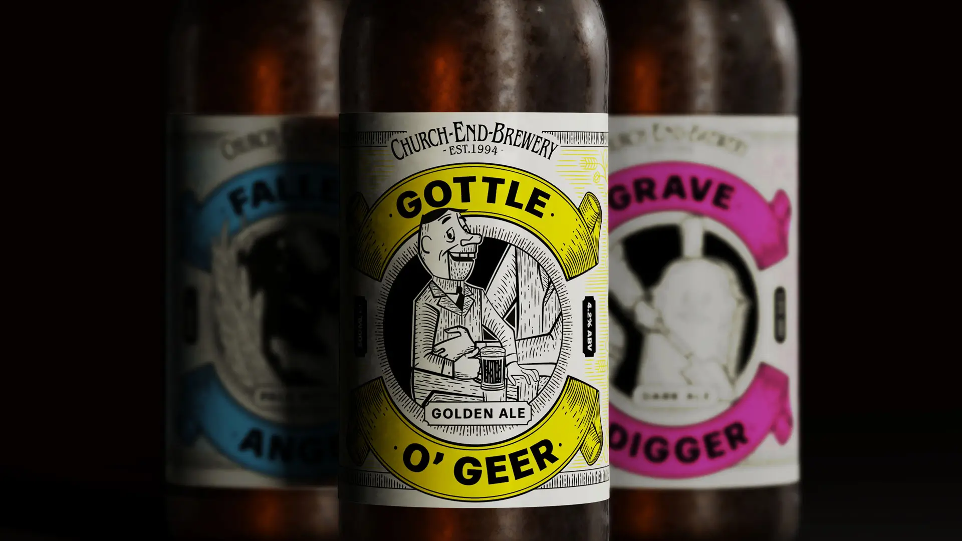
Over a 20-year period, Church End Brewery had developed a range of bottles beers on an ad hoc basis. There was no consistency in labelling, causing barriers to brand recognition and cross-variant purchase. It was time for a change.
Insights
Visual appeal of packaging design is vital in influencing customer decision-making at retail level. In fact, more than seven in 10 shoppers say packaging influences their purchasing decisions.
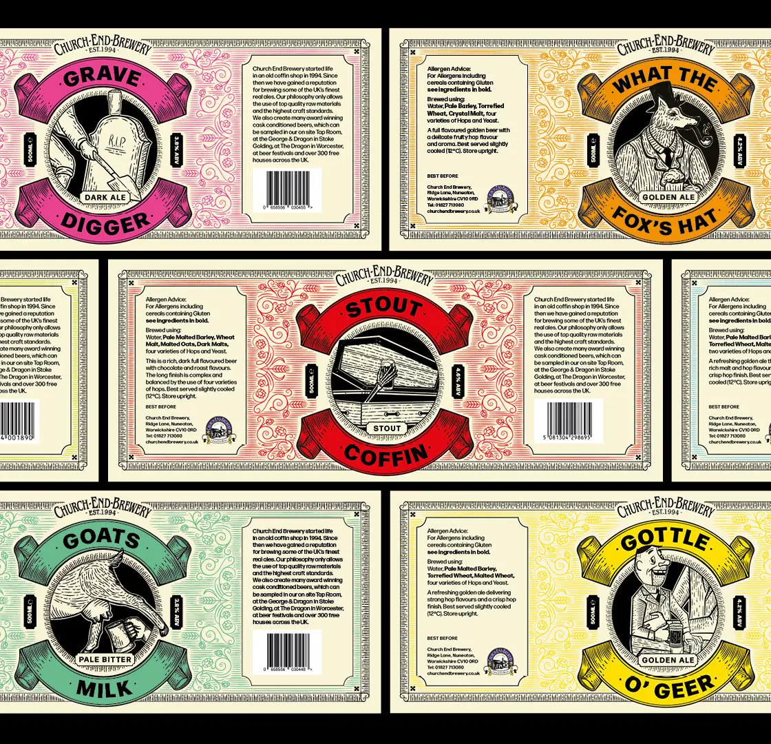
Using emotional intelligence
We realised we needed to find a balance between pleasing Church End’s existing older audience, and appealing to younger craft beer drinker accustomed to more vibrant contemporary packaging. Our solution was to redesign the full range of bottled beers in an eye-catching traditional woodcut design across the range with a broad and fresh colour pallet.
Results
From mid-2023 (when the new packaging was launched) to end-2025, bottle sales increased a staggering 82%.

“The creative work produced by RBH was entirely responsible for this magnificent upsurge in sales which has continued since launch. The product remained the same, but the stand-out and consistency at point of sale generated and maintained sales across the entire bottled range.”
Karl Graves,
Head Brewer, Church End Brewery